Visualising complex data in the Open Targets Platform: our design process for Locus-to-Gene scoring representation
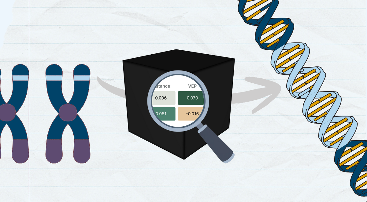
The Open Targets Platform’s Locus-to-Gene (L2G) machine learning algorithm integrates multiple sources of functional annotation evidence to prioritise genes that may be causally linked to disease-associated loci.
We recently implemented Shapley value-based explanations for L2G scores, which presented an interesting visualisation challenge for our Front-End team.
For an explanation of the L2G Shapley values, read our accompanying blogpost:
The current L2G model has 29 features and both the magnitude and direction of each Shapley value is important for interpretability. Furthermore, we have the option of communicating these values individually or using the additive property of Shapley values to ‘build’ the L2G score.
This rich information presents a design challenge of providing a diverse range of users with an intuitive ‘explanation’ of the L2G score, rather than simply overloading them with information, but also ensuring enough details are made available for illuminating the “black box” of the machine learning predictions.
Exploring Different Visualisations
With complex challenges like this, we find it useful to brainstorm and prototype different candidate visualisations. Popular interactive environments such as RStudio with ggplot2 or Jupyter with Seaborn are great choices for this, but for frontend work, we prefer a JavaScript alternative: Observable notebooks with the Observable Plot library. Since the Platform is written in JavaScript (React) and already uses Observable Plot, this approach gives us both quick prototyping and minimal additional work to polish the selected visualisation for the Platform.
We experimented with the following visualisations of the Shapley values.
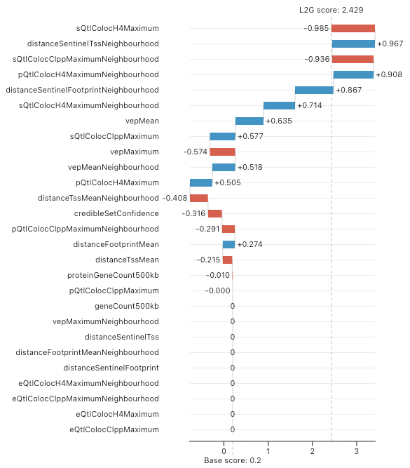
Waterfall Plot
In the machine learning community, a waterfall plot is often used to visualise Shapley values. This involves representing each Shapley value as a bar and offsetting the bars to indicate the score before and after the corresponding value is added. Features are ordered by descending Shapley value magnitude so it is clear which features have the largest impact on the final score.
Here is an example for our L2G score:
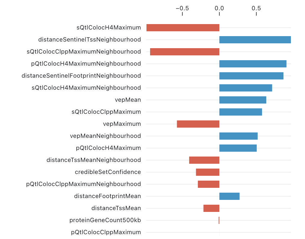
Bar Chart
Since many Platform users may not be familiar with waterfall plots, a slightly simpler approach is to sacrifice the cumulative structure (i.e. the bar offsets) and simply plot the Shapley values sorted by magnitude:
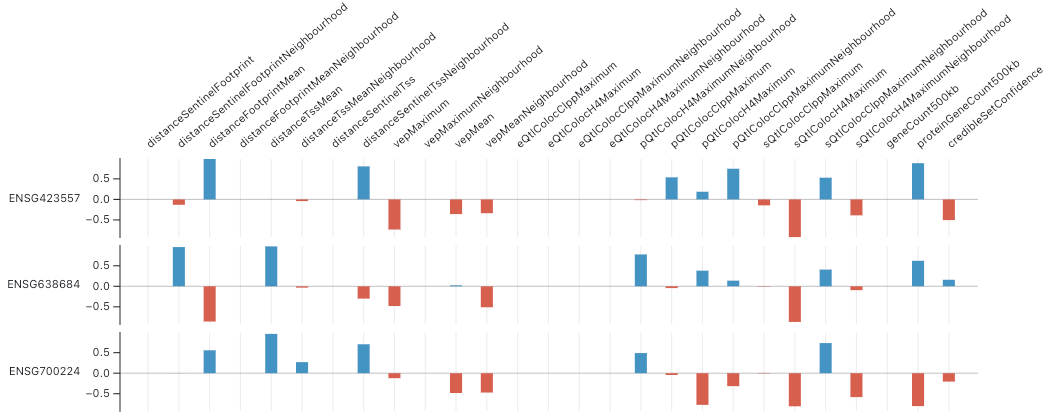
Faceted Bar Chart
We must also consider the possibility that multiple genes have significant L2G scores (we use a threshold score of 0.05 in the Platform) and Shapley values for each gene should be shown.
To accommodate multiple genes in the above plot, we can flip the dimensions so that each column is a feature and each row is a gene—this ensures the plot’s height rather than width will grow with the number of genes. There is no intuitive sorting order for the values when there are multiple genes but we can group features by category: distance, VEP, …
Heatmap
Visually, the faceted bar chart is somewhat noisy and overwhelming. Switching to a heatmap gives a more compact visualisation that is easier to read:
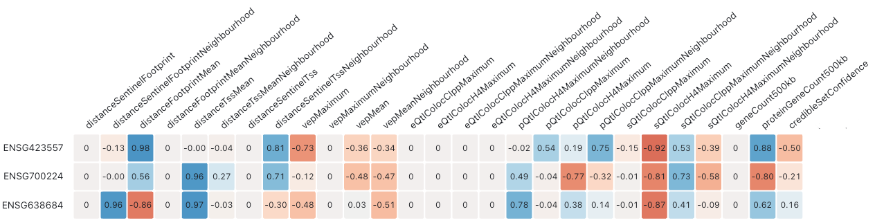
We can see that grouping the features by category has clear advantages. For example, it is easier to see that the distance features on the left make a strong net contribution in each row, whereas the VEP features make a negative net contribution. However, the large number of features still make the plot somewhat difficult and time-consuming to process.
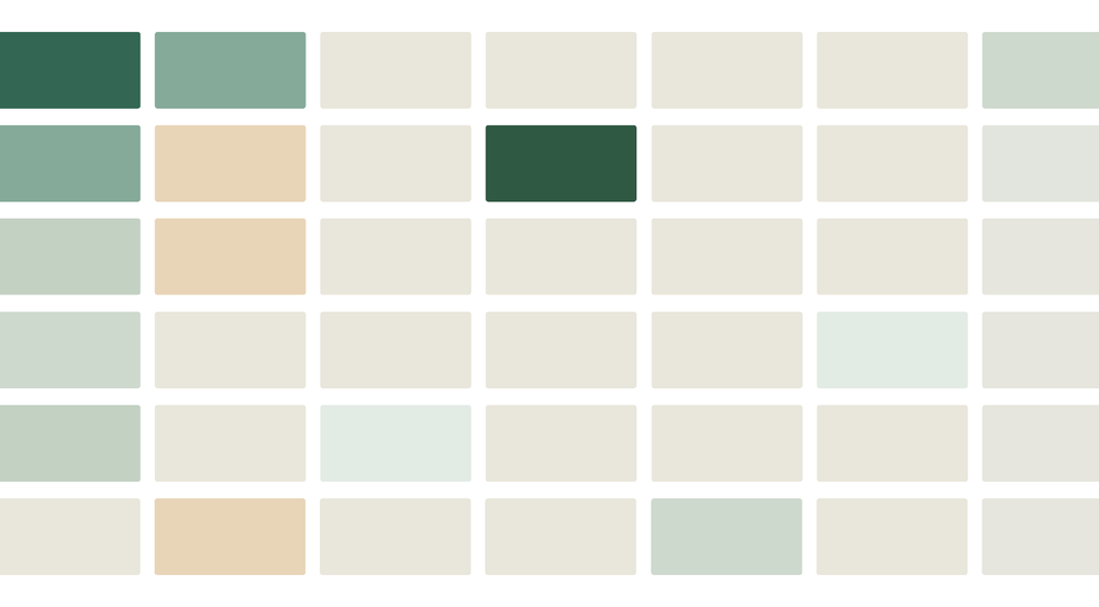
To address this, we can use the additivity of Shapley values to compute category-level scores. This dramatically reduces the number of columns, providing an effective high-level summary of the contributions that drive the L2G score for each gene:
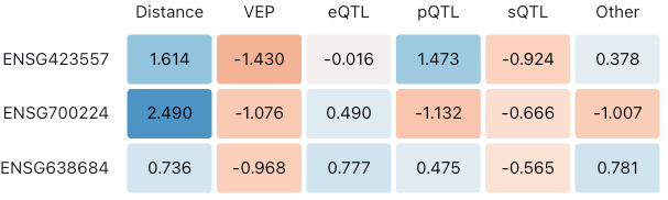
We believe that both novice and expert users of the Platform will appreciate this category level heatmap of the Shapley values as the initial view. In this particular case, we reimplement this Observable ‘plot’ as a React table to give us greater flexibility over styling and interactivity. After further polishing the table and switching to the Platform’s red-green colour scheme we have the final table shown in the platform:
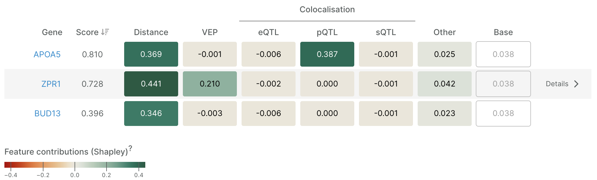
Users who wish to dig deeper can open a detailed waterfall plot for a gene of interest—to see all features, or just those corresponding to a table cell. Only minor changes to the original prototype were needed for this plot.
Here is the final waterfall plot of all features for the middle gene in the table above (opened by clicking on ‘Details’):
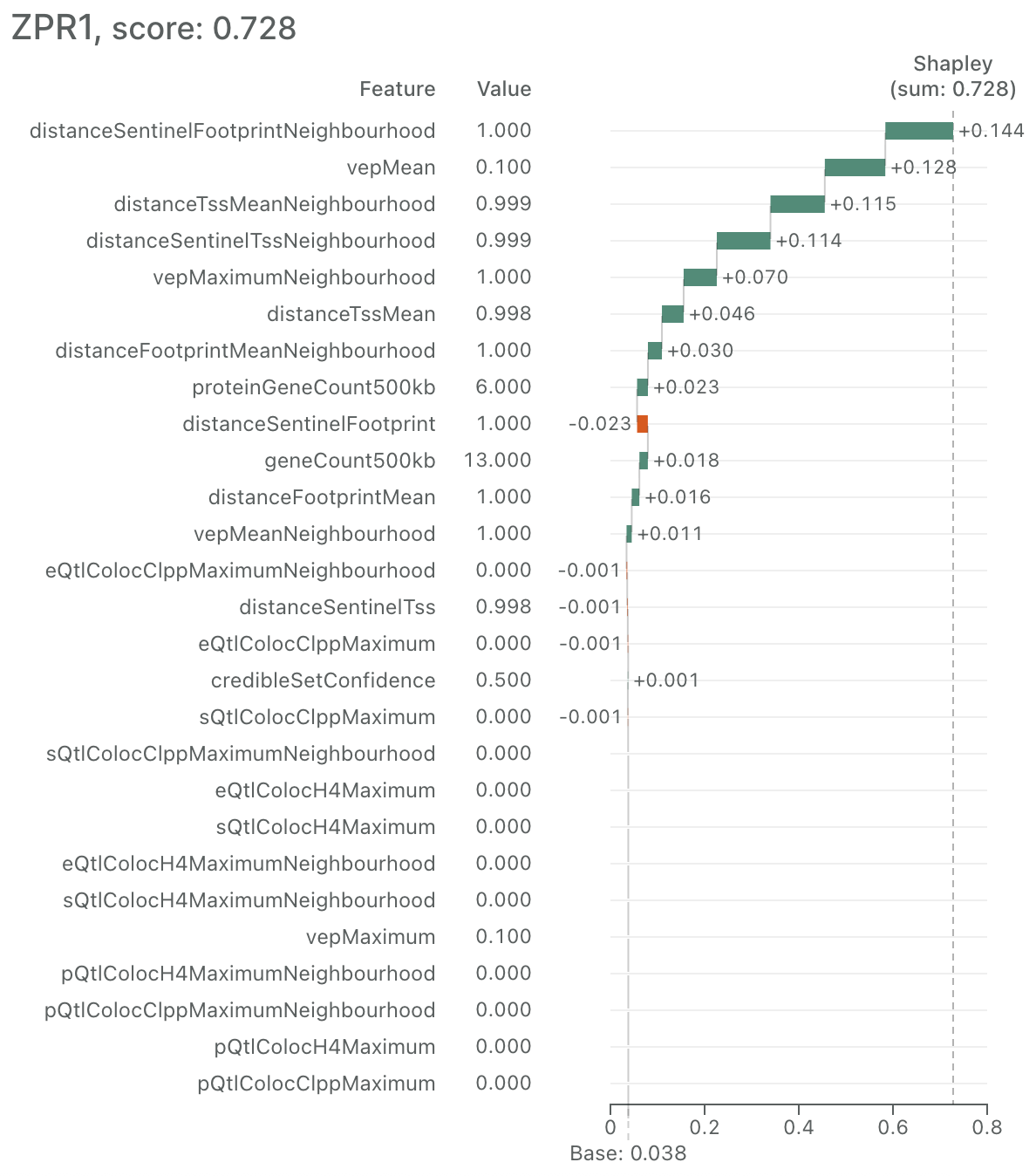
Overall, we believe the high-level heatmap plus 'details on demand' waterfall plot makes this complex information accessible to a wide audience without sacrificing depth.
That said, we are always looking to improve and welcome any feedback.