Get to know the Reactome enhanced pathway visualisations
This blog is a joint contribution by Konstantinos Sidiropoulos and Antonio Fabregat-Mundo (Reactome), and Denise Carvalho-Silva (Open Targets). You can contact Konstantinos, Antonio and their colleagues at help[at]reactome.org
Biochemical pathways can reveal a lot about therapeutic drugs and their targets, which in most scenarios are proteins. We can learn, for example, how a drug target behaves in health and disease, and how the modulation of the protein can affect disease progression. You can also find affected pathways that are common in a group of diseases, which in turn can open up new therapeutic opportunities.
Pathway data tends to be represented in one of two ways. Either accessible cartoons that summarise an often simplified view of the data or a detailed accurate representation that can be difficult to interpret for the casual user. We tend to be confronted with the following dilemma: how can we provide detailed pathway information for drug identification and selection without overwhelming our users?
We caught up with Denise Carvalho-Silva from Open Targets to tell her a bit more about pathway visualisations and the latest developments in Reactome. Denise started our Q&A by asking:
What is the aim of Reactome and how does it fit with the scope of Open Targets?
Reactome is a free, open-source, curated and peer-reviewed database of biochemical pathways. We also provide tools to facilitate visualisation, interpretation and analysis of pathway information.
Our work supports several domains of knowledge, from basic research to systems biology to drug discovery. It’s widely accepted in the scientific community that perturbed pathways can reveal dysregulated biological mechanism in diseased states. That’s where our collaboration with Open Targets comes in. We have been working together to provide evidence for associations between targets and diseases available in the Open Targets Platform. We curate biochemical pathways affected by mutations, which is provided to Open Targets in a JSON format. We also work with Open Targets to provide pathway visualisations for human proteins.
Can you tell us a bit more about the challenges in visualising pathway information?
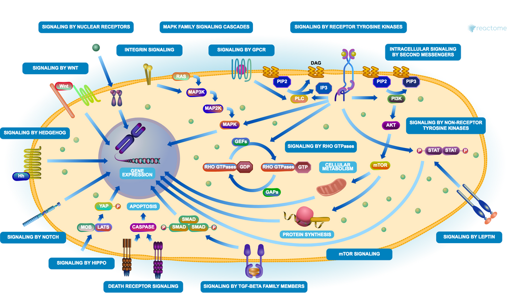
There is more to a pathway than meets the eye. How many interactions occur behind the scenes? Which interactors belong to a pathway? What are the co-factors necessary for the pathway to function well? What pathways are described both up and downstream? It’s really a rather complex matter, often tricky to get displayed in an intuitive visualisation.
What we first did was to simplify the complexity by organising pathways in a hierarchical fashion, similar to what we see in Gene Ontology, for example. We group detailed pathways into larger domains of biological function, namely:
- LLP or lower level pathways, where the molecular processes are annotated as series of very detailed reactions
- HLP or higher level pathways, where pathways within a similar biological process are aggregated and visualised as green boxes
Secondly, we drew some green box icons that we hoped would allow for easier navigation from higher level pathways to more detailed views.
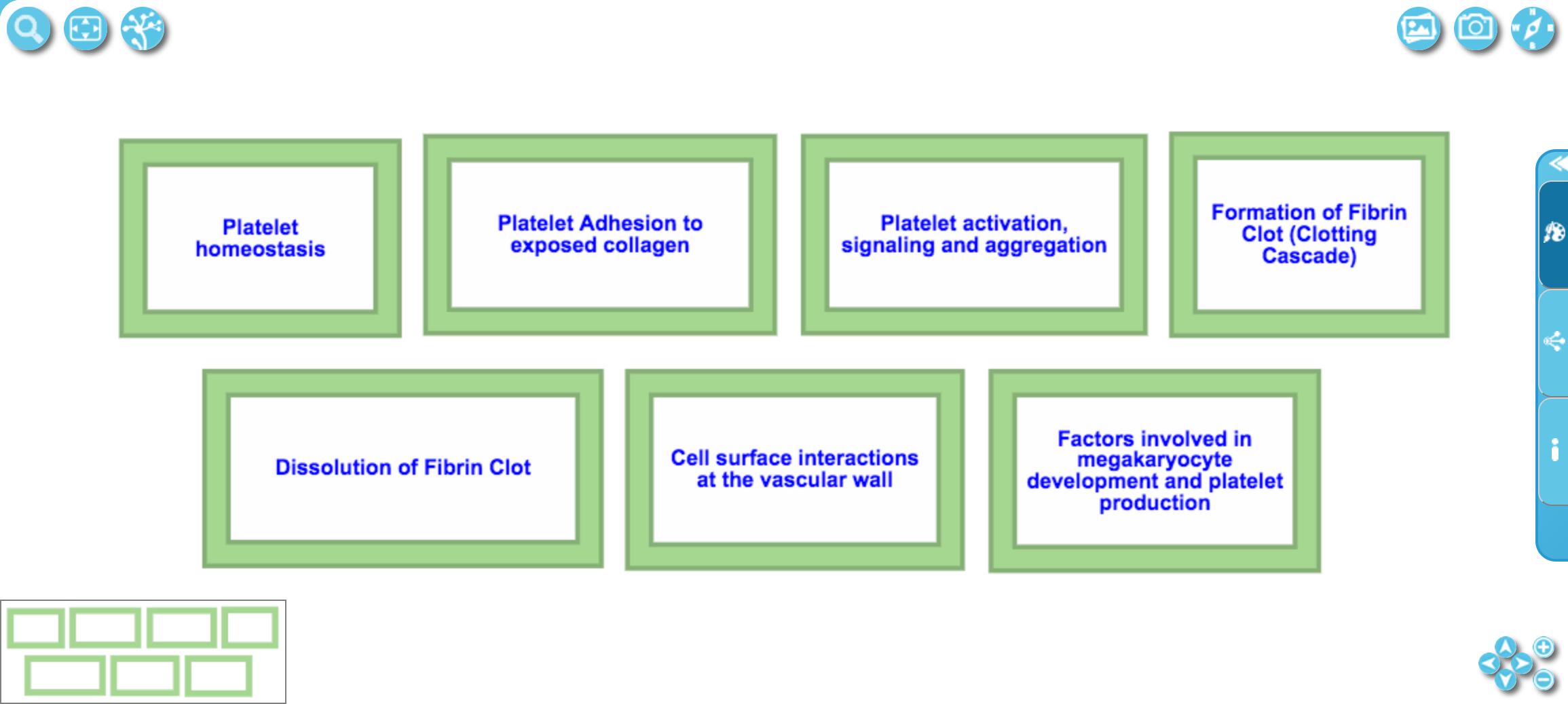
An example of a higher level pathway, where pathways related to Hemostasis are aggregated and visualised as green boxes.
We then sought feedback from our users by carrying out usability sessions. It became clear that our visualisation was not fit for purpose:
- users could not find the information they wanted
- users could not navigate to subpathways
- users could not overlay views of their own data
We had to change this. We had to provide more interactivity. We had to create visuals that were intuitive and more pleasing to the eye. Visuals that our users would say “wow”.
Get to know the Reactome enhanced pathway visuals in action.
Wow! These are really stunning. I’m assuming you have stumbled upon several challenges implementing these new diagrams.
Very much so. One of the challenges we had to face was to choose how to store the new illustrations. The choices were mainly from PNG, JPEG and SVG. We picked the latter as:
- it is easy to edit
- its resolution is maintained at varying levels of zooming
- it contains interaction features for richer interfaces
- its data is in text format or XML (can be handled by computer programs or text editors)
- it is supported by the most popular web browsers*
- it is the format mostly used by designers working on Adobe Illustrator, Corel Draw, and others
Another challenge we had was to provide 1-2-1 mapping between the annotated pathway hierarchy and the graphical elements. Luckily we had a team of amazing curators and illustrators working together to generate some of high quality overview diagrams we now have in place.
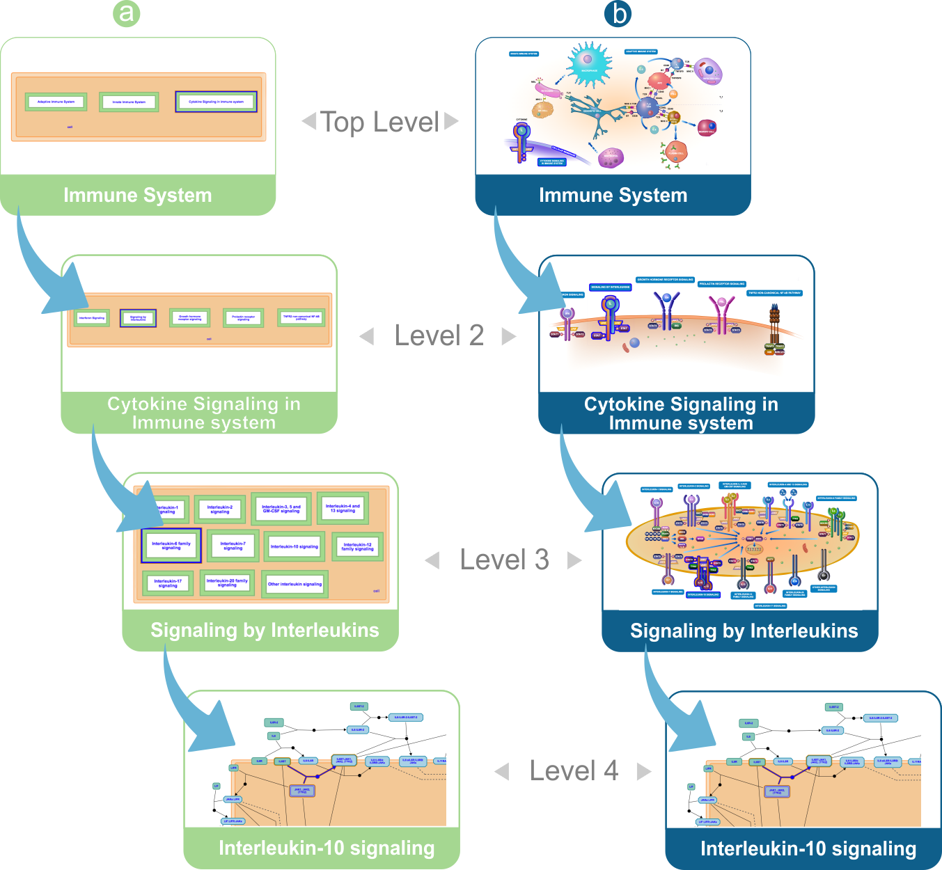
Sequence of pathway diagrams from Immune System to Interleukin-10 signaling. (a) HLDs presented in their classic form. (b) HLDs presented in their enhanced form.
We also managed to implement an SVG rendering component in our website to allow for zooming, panning, and also highlighting and clicking with a mouse. It’s much more fun now to navigate these visuals.
I’m sure it is. Is the code for these new visuals available anywhere so that our users can re-use them?
Yes, we strongly encourage the community to re-use our visualisations. We are open source and all the important code is available on our GitHub repo. Our EHLDs can be reused from our stand-alone JavaScript diagram viewer as well. This is exactly what Open Targets has done.
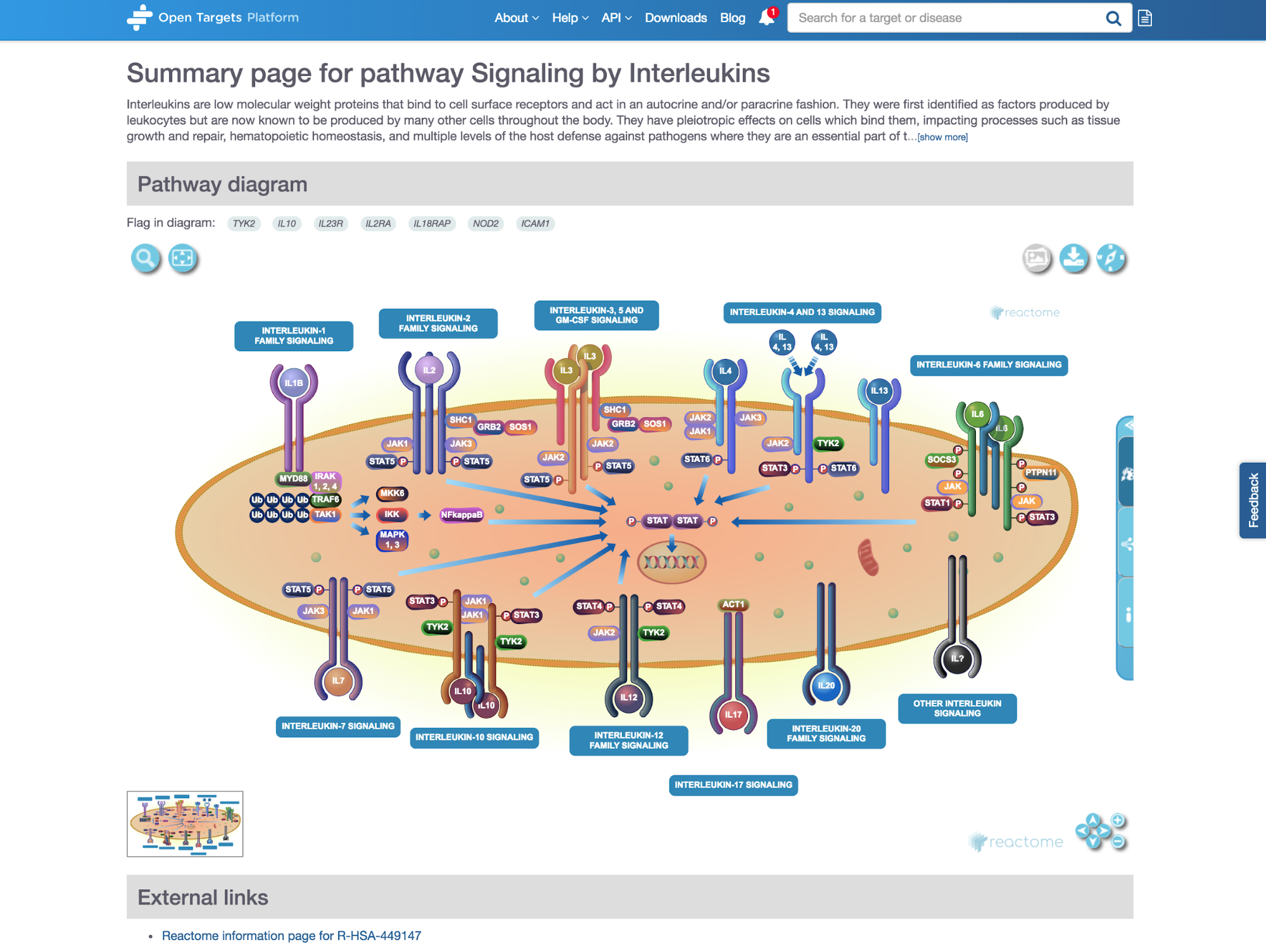 *Diagram widget integrated in the Open Targets Platform.*
One of the places you can see our visuals is in the pathway page of the Open Targets Platform, for example the Signaling by Interleukins pathway.
We also have the icon library with 1,050 different visual components - we would love everyone to make use of this.
Cool. I’m intrigued that we can still see some old visualisations from Reactome in our Open Targets Platform. Can you say a bit more about why this is the case?
That’s correct. Not all Reactome pathways will be in EHLDs; only the higher level pathways (HLPs) for now. Our goal is to have the visualisations for all our 89 HLPs with a textbook feel to them by the end of this year. As we speak, we are working on the set of higher level pathways not yet converted to EHLDs. This corresponds to 11% of all HLPs, i.e. only 10 pathways.
It's been great to learn more about the new Reactome visuals, thank you for taking part in this Q&A. Before we go, do you have any final comments?
We were super thrilled with the amazing response and feedback we had from the research community, including users of the Open Targets Platform. We will now work on additional export options, and investigate better search capabilities for both our pathway diagrams and our icon library. We welcome further feedback and suggestions on our HelpDesk.