An approach to visualising pathway evidence
Please note that since the release of the Next-Generation Open Targets Platform, the REST API is no longer available. Check out the new Platform documentation for further details.
The starting point in drug discovery is often a specific target or disease. But what if instead you have a specific pathway to start with?
As part of an Open Targets research project on the complement system pathway, I wanted to find approaches to visualise genetic evidence and still maintain information about its mechanisms. This is particularly relevant for the complement pathway: although functional genetic variants on their own have a tiny effect on a phenotype, they can act synergistically to disrupt complement functionality and lead to disease, as reported by Harris et al.
So I wondered: can I visualise how genetic evidence for a disease is distributed across a pathway and find new gene-disease associations by looking at a cluster of low-confidence associations around a protein complex or reaction?
Although I decided to focus on genetic associations of genes with disease, you could use this very same approach for other evidence types such as expression data. I knew that a heat map displayed through Shiny could quickly convey gene-disease associations, so I decided to use that.
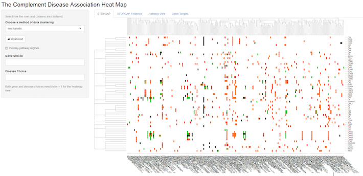
Each entry in the heat map above represents a genetic association between a complement gene (row), such as C3, for example, and a disease (column). The significance of this association is denoted by a traffic light colouring ranging from dark green (highly significant) to red (weak significance), whereas white means no association. By default, the gene and disease clusters are “mechanistic”. This means that the genes are clustered according to their position in the complement pathway i.e. whether they encode for the same complex or, at a higher level, occur in the same part of the pathway. Disease clustering is based on similarity of diseases according to MeSH tree IDs.
In this heat map, you can choose areas to zoom in, select specific genes and diseases, or choose different clustering options (e.g. data-driven), available from a drop-down menu on the left.
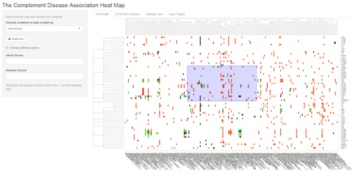
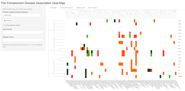
You can also view the underlying genetic evidence (look for the separate tabs at the top of the map) or choose the pathway view that maps the genetic evidence onto the complement pathway, so that multiple diseases can be compared at the same time.
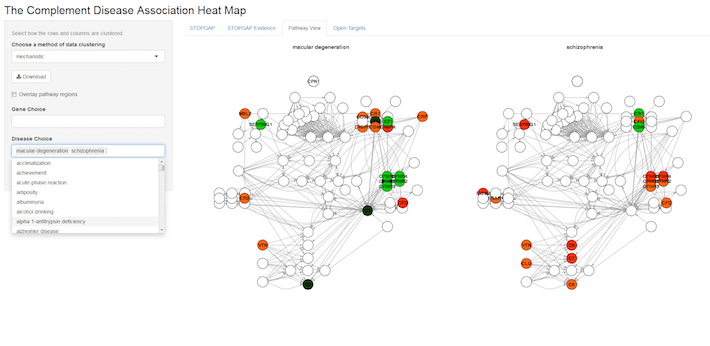
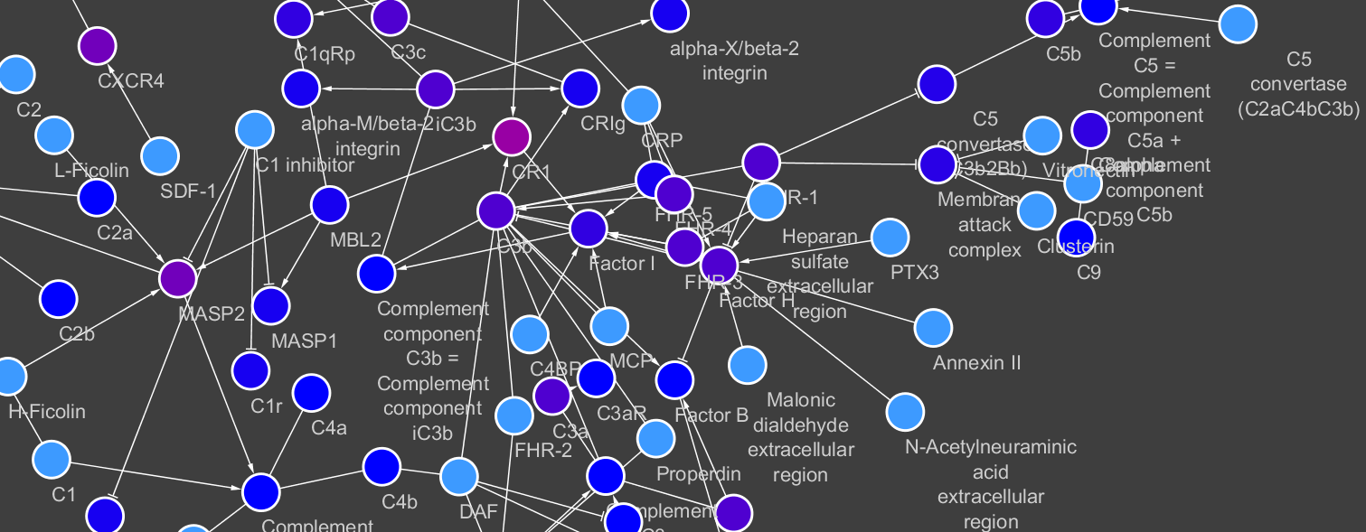
In theory, this approach can be extended to any pathway for which you want to summarise genetic (or other) evidence with diseases. The gene dendrogram could be built through gene-protein complex relationships available from Reactome and MeSH terms. You could also use other ontologies to create the disease dendrogram. At the moment, the pathway display still requires some manual editing. I still need to find a way to best display the hierarchical layout for biological pathways in an automatic manner. In the meantime, I arranged the network in Cytoscape and exported the coordinates for a pathway-specific layout. That was really quick and easy and I can now explore interesting hypotheses on gene-disease evidence and at the same time conserve information about the mechanism in the pathway.
The code used to produce and query the interactive figures will be available soon, so stay tuned.
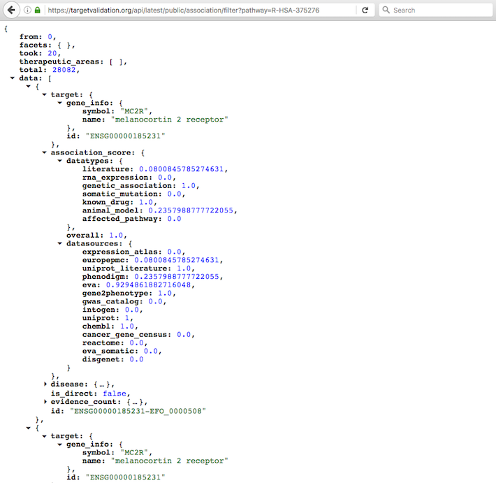
In the meantime, why not use our REST API to search for a pathway and get the possible drug targets linked to it? This is one of the calls you can use:
https://targetvalidation.org/api/latest/public/association/filter?pathway=
Pop in the Reactome ID (e.g. R-HSA-375276 for Peptide ligand-binding receptors) at the end of the URL above and get all targets and diseases linked to R-HSA-375276.
Check our API documentation for more details and
get in touch if you have any questions or suggestions on this topic.